|
|
|
|
Quelle README.stories.md Sprache: unbekannt
|
|
Spracherkennung für: .md vermutete Sprache: Unknown {[0] [0] [0]} [Methode: Schwerpunktbildung, einfache Gewichte, sechs Dimensionen]
# MozButton
`moz-button` is a reusable, accessible, and customizable button component designed to indic ate an available action for the user.
It is a wrapper of the `<button>` element with built-in support for label and title, as well as icons.
It supports various types (`default`, `primary`, `destructive`, `icon`, `icon ghost`, `ghost`) and sizes (`default`, `small`).
```html story
<div style={{ display: 'flex', justifyContent: 'center', gap: '1rem', flexWrap: 'wrap' }}>
<moz-button label="Default">"Default"</moz-button>
<moz-button type="primary" label="Primary"></moz-button>
<moz-button type="destructive" label="Destructive"></moz-button>
<moz-button iconsrc="chrome://global/skin/icons/more.svg"
tooltiptext="Icon">
</moz-button>
<moz-button iconsrc="chrome://global/skin/icons/more.svg"
tooltiptext="Icon Ghost" type="ghost">
</moz-button>
<moz-button type="ghost" label="Ghost"></moz-button>
<moz-button type="split"
label="Split">
</moz-button>
</div>
```
More information about this component including design, writing, and localization guidelines, as well as design assets, can be found on our [Acorn site](https://acorn.firefox.com/latest/components/button/desktop-udQAPeGf).
## Usage guidelines
### When to use
* Confirm an action or make a change.
### When not to use
* Don't use buttons in place of links.
* Don't use buttons to navigate in-page or to new pages.
### Avoid these common mistakes
* Do not change button types (e.g., `primary` to `destructive`) based on hover or interaction.
* Do not change button text or labels based on user interaction (e.g. don't change the button text on hover).
* Do not create "[Schrödinger’s Buttons](https://docs.google.com/presentation/d/1YZ0S9cl6Gd7H468-86YfnTrGkbkdH-lawRCVAGnWJDs/edit#slide=id.g2ff3e0a4a35_0_0)," i.e. buttons that only become visible when hovered or focused via keyboard.
## Code
The source for `moz-button` can be found under [toolkit/content/widgets/moz-button/](https://searchfox.org/firefox-main/source/toolkit/content/widgets/moz-button)
## How to use `moz-button`
### Importing the element
Like other custom elements, you should usually be able to rely on `moz-button` getting lazy loaded at the time of first use.
See [this documentation](https://firefox-source-docs.mozilla.org/browser/components/storybook/docs/README.reusable-widgets.stories.html#using-new-design-system-components) for more information on using design system custom elements.
### Setting the `type`
##### Default
If you won't explicitly set the `type` of `moz-button`, it will be set to `default`. In this case you will get a regular button, also known as a "Secondary" button.
A regular button may appear beside a primary button, or alone. Use it for secondary actions (e.g., Cancel) or for multiple actions of equal importance.
```html
<moz-button label="Button"></moz-button>
```
```html story
<moz-button label="Button"></moz-button>
```
##### Primary
Primary buttons represent the most important action on a page and stand out with distinct styling. To avoid visual clutter, only one primary button should be used per page.
```html
<moz-button type="primary" label="Primary"></moz-button>
```
```html story
<moz-button type="primary" label="Primary"></moz-button>
```
##### Destructive
Destructive (Danger) buttons typically appear in dialogs to indicate that the user is about to make a destructive and irreversible action such as deleting or removing a file.
```html
<moz-button type="destructive" label="Destructive"></moz-button>
```
```html story
<moz-button type="destructive" label="Destructive"></moz-button>
```
##### Icon
Icon buttons are used for actions that can be easily represented with a symbol instead of text. They are ideal for saving space, simplifying the interface, or providing quick access to common functions like search, settings, or closing a window. However, they should include accessible tooltips to ensure clarity and usability.
There are two ways of providing an icon/image to `moz-button`:
1) You can either specify `type="icon"` and provide a background-image for the `::part`:
```html
<moz-button type="icon" title="I am an icon button" aria-label="I am an icon button"></moz-button>
```
```css
moz-button::part(button) {
background-image: url("chrome://global/skin/icons/more.svg");
}
```
2) Or you can provide an icon URI via `.iconSrc` property / `iconsrc` attribute, in which case setting `type="icon"` is redundant:
```html
<moz-button iconsrc="chrome://global/skin/icons/more.svg"
title="I am an icon button"
aria-label="I am an icon button">
</moz-button>
```
```html story
<moz-button iconsrc="chrome://global/skin/icons/more.svg"
title="I am an icon button"
aria-label="I am an icon button">
</moz-button>
```
You can also use `iconsrc` together with `label` to get a button with both icon and text.
```html
<moz-button iconsrc="chrome://global/skin/icons/edit-copy.svg" label="Button"></moz-button>
```
```html story
<moz-button iconsrc="chrome://global/skin/icons/edit-copy.svg" label="Button"></moz-button>
```
To adjust the icon's position, use the `.iconPosition` property / `iconposition` attribute. It accepts two values: `start` (the default) or `end`.
```html
<moz-button iconposition="end" iconsrc="chrome://global/skin/icons/edit-copy.svg" label="Button"></moz-button>
```
```html story
<moz-button iconposition="end" iconsrc="chrome://global/skin/icons/edit-copy.svg" label="Button"></moz-button>
```
To add a badge to the icon button, set `.attention` boolean property to `true` or add `attention` attribute to the markup.
```html
<moz-button iconsrc="chrome://global/skin/icons/more.svg"
title="I am an icon button"
aria-label="I am an icon button"
attention>
</moz-button>
```
```html story
<moz-button iconsrc="chrome://global/skin/icons/more.svg"
title="I am an icon button"
aria-label="I am an icon button"
attention>
</moz-button>
```
##### Ghost
Ghost buttons are used for secondary or less prominent actions. They are ideal for optional actions, alternative choices, or when a clean, subtle look is desired.
```html
<moz-button type="ghost" label="I am a ghost button"></moz-button>
```
```html story
<moz-button type="ghost" label="�� I am a ghost button"></moz-button>
```
#### Menu Button
When `moz-button` is given a `menuId` property, it functions as a menu button. This property links the button to an associated [panel-list](https://searchfox.org/firefox-main/source/toolkit/content/widgets/panel-list/panel-list.mjs) component, which will act as the popup menu. The `menuId` must correspond to the ID of that `panel-list` element.
This built-in integration with `panel-list` offers several automatic features:
* The button is automatically assigned `aria-haspopup="menu"`.
* The `aria-expanded` attribute is managed for you, reflecting the open or closed state of the panel.
* All necessary event listeners to open and close the `panel-list` are handled automatically.
**Note:** The menu must exist in the same root node (e.g. shadow DOM or document) as the button.
For now, you can't associate other types of menu with `moz-button` using `menuId`. In that case you must manually manage:
* `ariaExpanded` property / `aria-expanded` attribute - to reflect the open/closed state of the menu.
* `ariaHasPopup` property / `aria-haspopup` attribute - to define the type of popup (menu, listbox, dialog, etc.).
```html
<moz-button iconsrc="chrome://global/skin/icons/more.svg"
title="More options"
aria-label="More options"
menuid="panel-list">
</moz-button>
<panel-list id="panel-list">
<panel-item>Option One</panel-item>
<panel-item>Option Two</panel-item>
<panel-item>Option Three</panel-item>
</panel-list>
```
```html story
<moz-button iconsrc="chrome://global/skin/icons/more.svg"
title="More options"
aria-label="More options"
menuid="panel-list">
</moz-button>
<div>
<panel-list id="panel-list" stay-open open>
<panel-item>Option One</panel-item>
<panel-item>Option Two</panel-item>
<panel-item>Option Three</panel-item>
</panel-list>
</div>
```
#### Split Button
Split Button is an action button combined with an adjacent menu button offering additional options. To create a split button, set the `type` to `split` and provide a `menuId` that links to a `panel-list` element. Split Button renders "More options" menu button with chevron icon and default `l10nId`.
```html
<moz-button type="split"
label="Split Button"
menuid="panel-list">
</moz-button>
<panel-list id="panel-list">
<panel-item>Option One</panel-item>
<panel-item>Option Two</panel-item>
<panel-item>Option Three</panel-item>
</panel-list>
```
```html story
<moz-button type="split"
label="Split Button"
menuid="panel-list">
</moz-button>
<div>
<panel-list id="panel-list" stay-open open>
<panel-item>Option One</panel-item>
<panel-item>Option Two</panel-item>
<panel-item>Option Three</panel-item>
</panel-list>
</div>
```
#### Toggle button
Adding `aria-pressed` to the `moz-button` turns it into a toggle button. The `aria-pressed` attribute represents the button's current "pressed" state.
Refer to [the W3C ARIA documentation](https://w3c.github.io/aria/#aria-pressed) for more information on using `aria-pressed` attribute.
```html
<moz-button label="Could be pressed" aria-pressed="false"></moz-button>
<moz-button label="Is already pressed" aria-pressed="true"></moz-button>
```
```html story
<div style={{ display: 'flex', gap: '1rem' }}>
<moz-button label="Could be pressed" aria-pressed="false"></moz-button>
<moz-button label="Is already pressed" aria-pressed="true"></moz-button>
</div>
```
### Setting the `size`
There are 2 options for the `moz-button` size: `default` and `small`. Small buttons are only used for smaller UI surfaces. (e.g., Infobar).
```html
<moz-button label="Default"></moz-button>
<moz-button label="Small" size="small"></moz-button>
```
```html story
<div style={{ display: 'flex', alignItems: 'center', gap: '1rem' }}>
<moz-button label="Default"></moz-button>
<moz-button label="Small" size="small"></moz-button>
</div>
```
### Setting the `disabled` state
In order to disable the `moz-button`, add `disabled=""` or `disabled` to the markup with no value.
```html
<moz-button label="Button" disabled></moz-button>
```
```html story
<moz-button label="Button" disabled></moz-button>
```
### Setting the `accesskey`
`accesskey` defines an keyboard shortcut for the button.
```html
<moz-button label="Button" accesskey="t"></moz-button>
```
```html story
<moz-button label="Button" accesskey="t"></moz-button>
```
### Customizing `moz-button`
You can add the inner padding on the `moz-button` to give the button a larger target, and make it clickable when the window and cursor are up against the edge of the screen.
Use the following variables to achieve this:
```
--button-outer-padding-inline - Used to set the outer inline padding of toolbar style buttons.
--button-outer-padding-block - Used to set the outer block padding of toolbar style buttons.
--button-outer-padding-inline-start - Used to set the outer inline-start padding of toolbar style buttons.
--button-outer-padding-inline-end - Used to set the outer inline-end padding of toolbar style buttons.
--button-outer-padding-block-start - Used to set the outer block-start padding of toolbar style buttons.
--button-outer-padding-block-end - Used to set the outer block-end padding of toolbar style buttons.
```
### Fluent usage
The `label`, `tooltiptext`, `title` and `aria-label` attributes of `moz-button` will generally be provided via [Fluent attributes](https://mozilla-l10n.github.io/localizer-documentation/tools/fluent/basic_syntax.html#attributes).
The relevant `data-l10n-attrs` are set automatically, so to get things working you just need to supply a `data-l10n-id` as you would with any other element.
**Note:** [Bug 1945032](https://bugzilla.mozilla.org/show_bug.cgi?id=1945032) should be fixed before we add automatic fluent support for the `accesskey` attribute. For now `accesskey` should be manually added to the `data-l10n-attrs` if needed.
For example, the following Fluent messages:
```
moz-button-ftl-id = This is the visible text content!
moz-button-labelled =
.label = Button
moz-button-titled = Button
.tooltiptext = Button with title
moz-button-titled-2 =
.label = Button
.title = Another button with title
moz-button-aria-labelled =
.aria-label = Button with aria-label
moz-button-with-accesskey = Button
.accesskey = t
```
would be used to set text and attributes on the different `moz-button` elements as follows:
```html
<moz-button data-l10n-id="moz-button-ftl-id"></moz-button>
<moz-button data-l10n-id="moz-button-labelled"></moz-button>
<moz-button data-l10n-id="moz-button-titled"></moz-button>
<moz-button data-l10n-id="moz-button-titled-2"></moz-button>
<moz-button data-l10n-id="moz-button-aria-labelled"></moz-button>
<moz-button data-l10n-id="moz-button-with-accesskey"></moz-button>
```
[Dauer der Verarbeitung: 0.13 Sekunden, vorverarbeitet 2026-09-30]
|
2026-10-10
|
|
|
|
|
Neuigkeiten |
| Aktuelles |
| Motto des Tages |
|
Open Source Software |
|
|
|
Jenseits des Üblichen ....

|
|
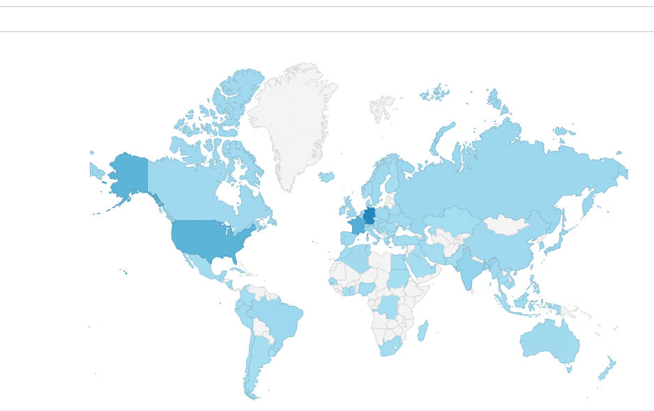
Besucherstatistik |
|
|
| Statistik |
| #Sources=1126864 |
| #Domains=1897691 |
|
|